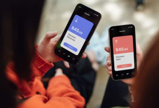

Mobile payments have become so familiar that many people move through them almost automatically. A tap chooses the amount, another opens a wallet or card screen, and the confirmation can be over in seconds. That speed is convenient when the details are clear. It becomes a problem when the user cannot tell whether a payment is pending, declined, duplicated, or already completed. Entertainment services add another layer because deposits may happen during a fast-moving session. A good mobile payment screen should reduce uncertainty before and after the tap, showing the amount, currency, payment method, status, and what the user can expect next.
The final amount should be visible on the final screen
A desi casino mobile online service should not make the user reconstruct a deposit from several earlier pages. Before confirmation, the screen needs to show the amount and currency in one place, along with any fee the service itself displays. If a payment provider opens in a new window, the user should still be able to recognize the transaction being authorized. The final button should describe an action that makes sense, rather than relying on a vague label that could mean continue, review, or pay.
This matters on smaller screens because details can be pushed below the fold. A person may see the confirmation button before seeing the full amount or payment method. Layouts should place the transaction summary close enough to the action that the user does not need to scroll back and forth to remember what is being approved.
Pending is different from failed
One of the most confusing payment states is the period after a request has been sent but before the result is final. A blank screen or spinning icon can tempt the user to tap again. The interface should instead say that the payment is being processed and prevent duplicate submission while that request remains active. If it fails, the message should say so. If it succeeds, the account history should reflect that result. These states sound basic, yet they prevent a large share of avoidable confusion.
Bank notifications can arrive at a different time from the service update, so users should check both records before making a second attempt. A temporary mismatch does not automatically mean money disappeared. It means the transaction needs a clear status rather than another tap. Currency conversion can add another source of confusion when the card and account use different currencies. The final screen should show the currency being charged, while the card issuer may later display its own conversion. Keeping those two stages separate helps the user understand why the bank statement may not match the on-screen number exactly.
Saved cards trade friction for speed
Saving a card or wallet makes repeat payments faster, which is useful for many ordinary purchases. In betting or casino services, that convenience can also shorten the pause before spending. Adults who gamble where it is legal can keep stronger control by requiring biometric or passcode approval for every transaction. A fixed entertainment amount should be set before the session, with rent, groceries, medicine, transportation, debt payments, and family expenses excluded from it.
Payment details worth checking before confirmation
- Exact amount and currency.
- Selected card, wallet, or other payment method.
- Any displayed service fee or conversion information.
- Whether the transaction is new, pending, or already completed.
- Whether device authentication is required.
- Whether the deposit stays inside a pre-set entertainment budget.
Withdrawal screens deserve the same clarity
A service that makes deposits simple should not turn withdrawals into a maze. The user should be able to see available methods, current status, and any verification step needed before the request can proceed. If extra identity checks are required, the reason and document type should be explained before files are uploaded. Repeatedly asking for the same information creates uncertainty and encourages users to contact support before they know whether anything is actually wrong.
Transaction history should also distinguish deposits from withdrawals and show dates in a consistent format. This gives the account owner a straightforward record to compare with bank or wallet statements. When money is involved, good interface design is largely the art of making states hard to misunderstand.
Fast payments work best when the user never has to guess
The ideal mobile payment flow does not feel fast because it hides information. It feels fast because each step answers the next question before the user has to ask it. What amount is being sent? Which method is being used? Did the request go through? Is another action needed? Clear answers prevent duplicate attempts and make it easier to notice unfamiliar activity. For adult gambling services, that clarity should sit beside visible spending controls and firm personal limits. Speed is useful when it removes waiting. It becomes risky when it removes the pause needed to understand what just happened.